Summary:
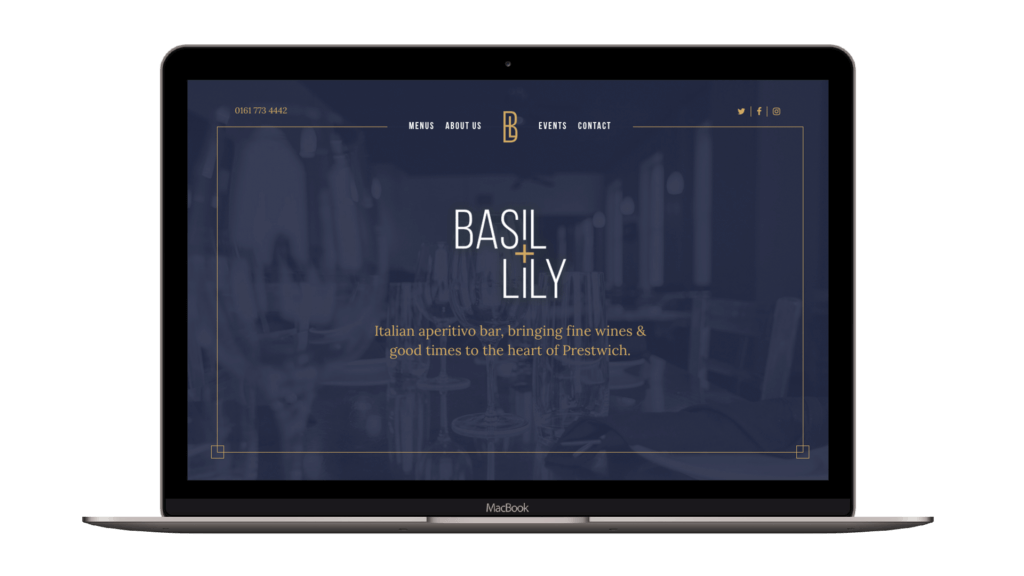
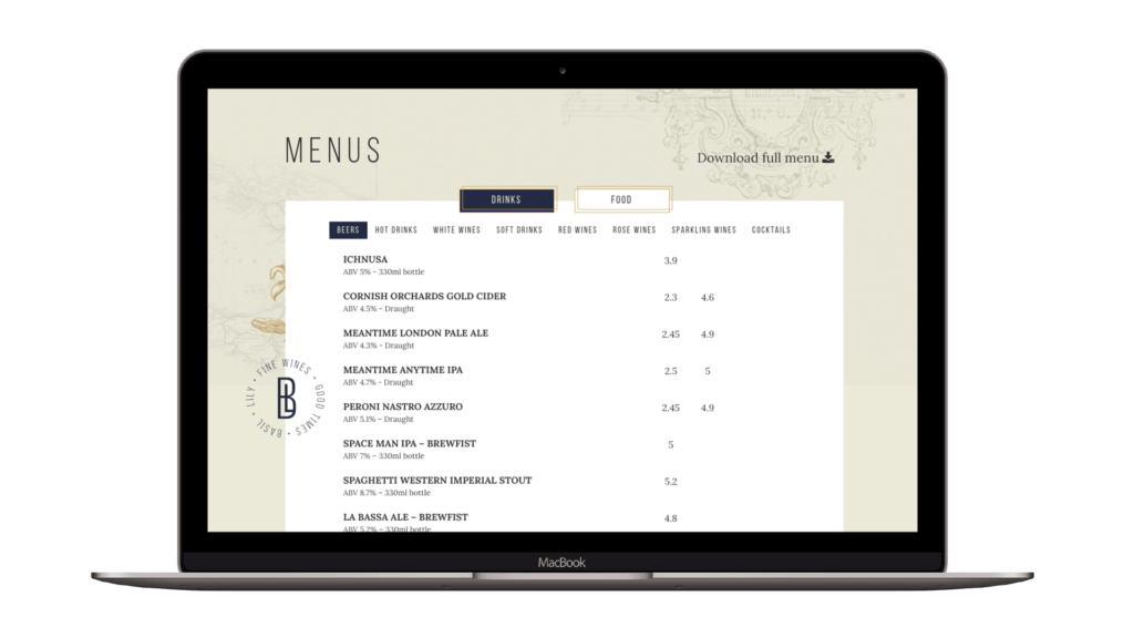
Let’s get down to the nitty-gritty. Basil + Lily’s website needed to be easily navigable, natural, and clear. We ensured that the menus, contact information, and booking form were accessible from anywhere on the site. Generally, our top priority was to give users the best possible online experience.
We also installed a booking form which simulates natural language, giving customers an intuitive reservation process across desktop and mobile devices. To provide a full visual package, we included print materials and interior design elements alongside digital branding because we’re helpful like that.


