WordPress 3.8: New Features and What To Look Out For
A while back, Matt Mullenweg announced that WordPress 3.8 is due to be released on 12th December 2013 (tomorrow). The date was rather peculiarly set months ago, as WordPress generally doesn’t have deadlines for releases – if you get a month it is quite lucky. However, with Release Candidate 2 being out at the time of writing, it is looking hopeful that 3.8 will be out tomorrow.
Here are the main changes in the 3.8 release.

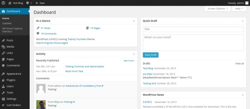
New Admin Interface based on MP6
The most noticeable change for most sites is the new Admin Interface on the site. The new interface is a flat, modern design and is fully responsive – which I believe is a first for the WordPress Admin interface.
The design is based on what was designed in MP6, which started life as a mysterious plugin uploaded by some of the core developers earlier this year. It’ll be interesting to see what happens with MP6. I have a feeling that this plugin will eventually be used by the UI team to develop ongoing work on the UI for WordPress. So if you want to see ongoing changes to the admin interface, install MP6 on a developmental site. Be warned though as there is a risk it could break your site, so it’s recommended to not install on live sites.
The interface is a lot cleaner and slicker, with more options. For example, if you don’t like the colours you can choose up to 8 new designs in the Users > Your Profile section – the “Light” is probably most similar to the old WordPress Interface.
The new design has been live on WordPress.com as a default for a few months now, so it may not be too new to some, however it could confuse some users.
I do like it, but I think the Default skin should be the aforementioned “Light” theme, as it’s a lot more familiar to most WordPress users.
Better Widget Management Screen
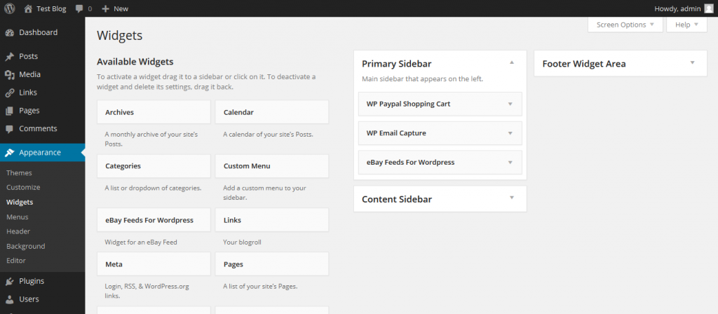
One of the highlights and a feature I do like is the brand new Widget Interface. It has been organised in such a way to give equal weight to both the widgets and the widget areas, making adding, removing and transferring widgets easier.
I feel it’s a good start, but it’s not perfect. It’s not too great on mobile devices still so for that I recommend accessibility mode. Also if you have a lot of widgets and inactive widgets it does require a lot of scrolling. I would like to see, on screens that can accommodate it, the widget areas to be fixed to the right hand side once you start scrolling. So on screens with lots of widgets you don’t have to scroll back to the top to add something to the sidebar, though admittedly this could lead to issues if you have a lot of widget areas.
However, I think the current design is a vast, vast, vast improvement.

Twenty Fourteen Theme
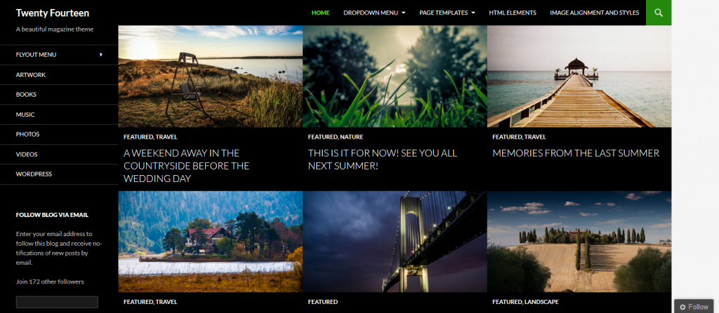
The final change which most people may not be able to recognise is the new Twenty Fourteen theme. It is the new default theme for WordPress, and it is a massive leap away from previous themes, in that it is a magazine theme style.
The issue with magazine themes is that they can be a bit of work to set up. I had Twenty Fourteen set up on my developmental server, which is full of code snippets and half finished plugins, and it looks ugly. However, I’m not using it properly, and recognise this.
Therefore, if you have a content rich site with post formats, custom post types and a lot of images with rich content then I can see people will use it loads. It comes quite feature packed, and it is fully responsive as well.
To view a demo of Twenty Fourteen check out http://twentyfourteendemo.wordpress.com/, and should you wish to check out the theme before release you can install it on a WordPress.com account.
As said, WordPress 3.8 is scheduled to be released tomorrow, so be sure to check it out! What are your thoughts on WordPress 3.8? Do you like the new look? Leave your thoughts in the comments.

