The Colours and Words That Will Convert
Did you know that certain colours and words can evoke different emotions? If you did, don’t click off this post just yet! In this article, we’ll give you a greater insight into the colours and language that can drive conversions, and show how you can use this to your advantage in your marketing activities.
What is conversion copywriting?
Conversion copywriting is writing content and bending words to elicit a certain response or action from the reader. The end result doesn’t necessarily need to involve a sale or transaction, instead, you can use conversion copywriting to encourage simple actions such as:
- Signing up to an email marketing list
- Adding an item to the shopping basket
- Clicking through to social media pages
- Increasing the average time spent on the site
Conversion copywriting encompasses everything we know about human behaviour, psychology and language, and combines both scientific evidence and creativity to create tailored messages for the audience you want to target.
Copywriting hacks to trigger conversions
You can use conversion copywriting in your website content and social media marketing to evoke a certain emotion or trigger an action from your target audience.
Once you know which action you want to encourage, you need to select the right language, tone and sentence structure that will achieve the intended response.
Power words for headlines
If you want to write headlines that will draw readers in, there are certain ‘power words’ that you can use to evoke an emotional response, and thus, gain more clicks, shares and likes for your content.
Your headline is the first part of your content that potential customers will see, therefore, working on the best title to draw readers in, is just as important as perfecting the rest of your copy.
Some of the power words and phrases you could use for your headlines include:
- Essential
- Proven
- Sexy
- Guarantee
- Major
- Key
- Latest
In reality there are a countless number of power words that you could include in your headlines. However, it’s crucial that you remember the SEO aspect too. Write your SEO-friendly headline first, and then see if you can fit any suitable power words within it. This will help you to maximise the amount of people that will see your headline and (hopefully) click through to your content.
Are you in need of website copywriting services that will drive conversions? Contact the FireCask team below to see how we could help.
Contact Us
Which colours drive conversions?
Colour is another key aspect of your branding and marketing communications. Different colours can evoke different emotions, therefore, this will need careful consideration when deciding on the right colours for your brand.
Blue

Blue is a colour that is seen as inviting and trustworthy, which is why it is a popular choice for financial services brands and banks. It has also been proven to have a calming effect, although, brighter shades of blue can also make you feel more energised.
Blue would work well for CTA buttons because of its inviting nature. However, it’s also important that colours that you choose are in keeping with your brand’s colours.
Whilst blue is a colour that is appropriate for most types of business, it shouldn’t be used for food brands. This is because studies have shown that blue can act as an appetite suppressant, and blue foods are uncommon in the wild, therefore, this can cause an ‘off-putting’ effect when the colour blue is associated with food.
Red

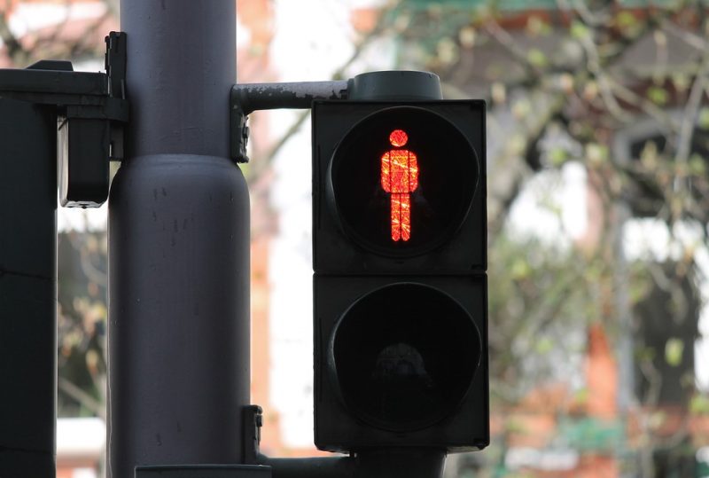
Red is considered to be a dominating colour and it evokes strong feelings of excitement, passion and aggression. It also stimulates feelings of power, which is why it is often used for stop signs and CTA buttons.
It’s important that this colour is used judiciously, because the more it is used the more it suppresses relaxation and this can evoke an unpleasant feeling for the viewer. To avoid this, use red sparingly or opt for different shades of red for a more positive impact.
Yellow

Yellow is a stimulating colour, and it is often linked to feelings of happiness. However, it has been proven to activate the part of the brain associated with anxiety, therefore, it can also have a negative effect depending on how it is used. This is the reason why bright yellow is used for warning and hazard signs, as it stimulates the brain and notifies the viewer of potential danger.
On the other hand, lighter shades of yellow can remind users of summer, sunshine and light, all of which have positive connotations. Therefore, this is a good option to go for if you want an easily-recognisable, vibrant colour for your brand.
Click here to read our post on the value of effective design for business for more information.
Whilst colours and words can have a significant impact on your potential customers, there are a whole host of additional aspects to consider if you want to maximise your online presence and make the most of your site.
Online marketing uses a wide range of tools to increase your site’s potential and drive conversions. With this, plus the tips above you’ll have the right resources in place to take your site to the next level.
